Back in December 2021, I wrote an article titled Defensive CSS. I used that term because that's really what is it about. I wanted a term that communicates the concept of writing CSS that prevents unexpected layout behaviors, or at least, reduces them.
It turned out that defensive CSS doesn't only apply to CSS, but UI design as well. As a designer, you need to either work on visual variations of a component with all the possible use-cases or at least communicate them clearly with the development team.
In this introduction article, I will shed the light on why it's important to design and write CSS defensively, and how we can take it from there.
Content can break layouts
One of the common reasons for having layout issues in CSS is content. Be it short or long, it can break a layout if we haven't thought carefully about it.
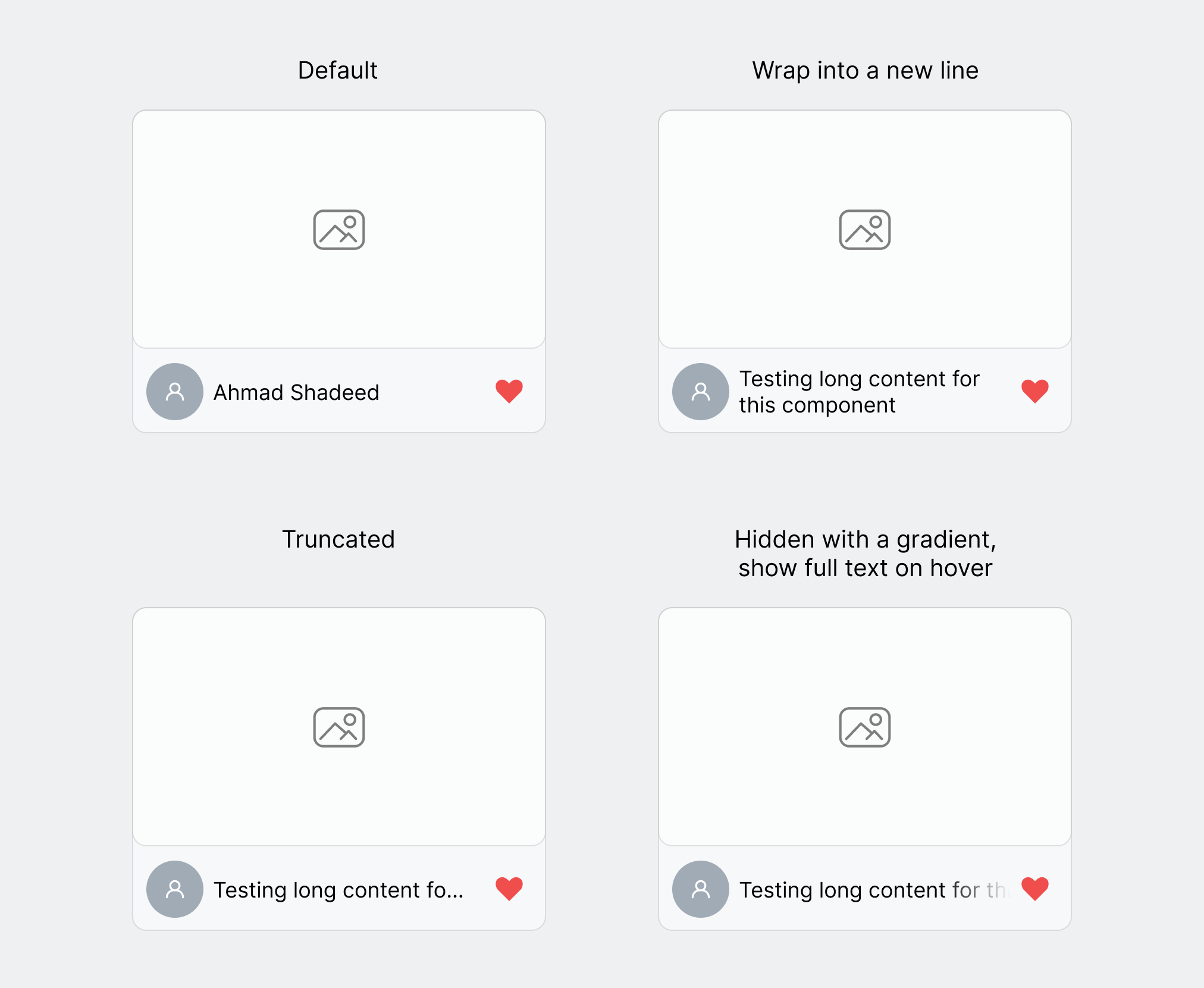
Consider the following basic example.
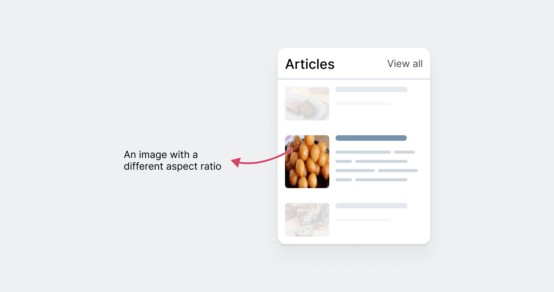
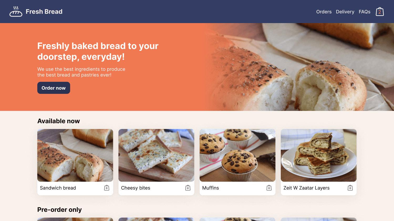
We have a component that is expected to be in a sidebar, which is limited space.
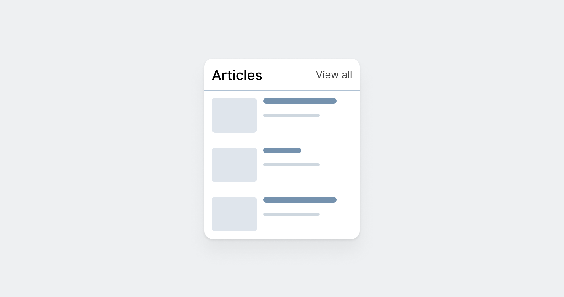
When the title is "Articles", everything looks good. However, if the content manager decided to change that name to a bit longer one, what will happen?
Depending on the CSS layout used, we can expect the title to wrap into a new line, or to push the link to a new line.
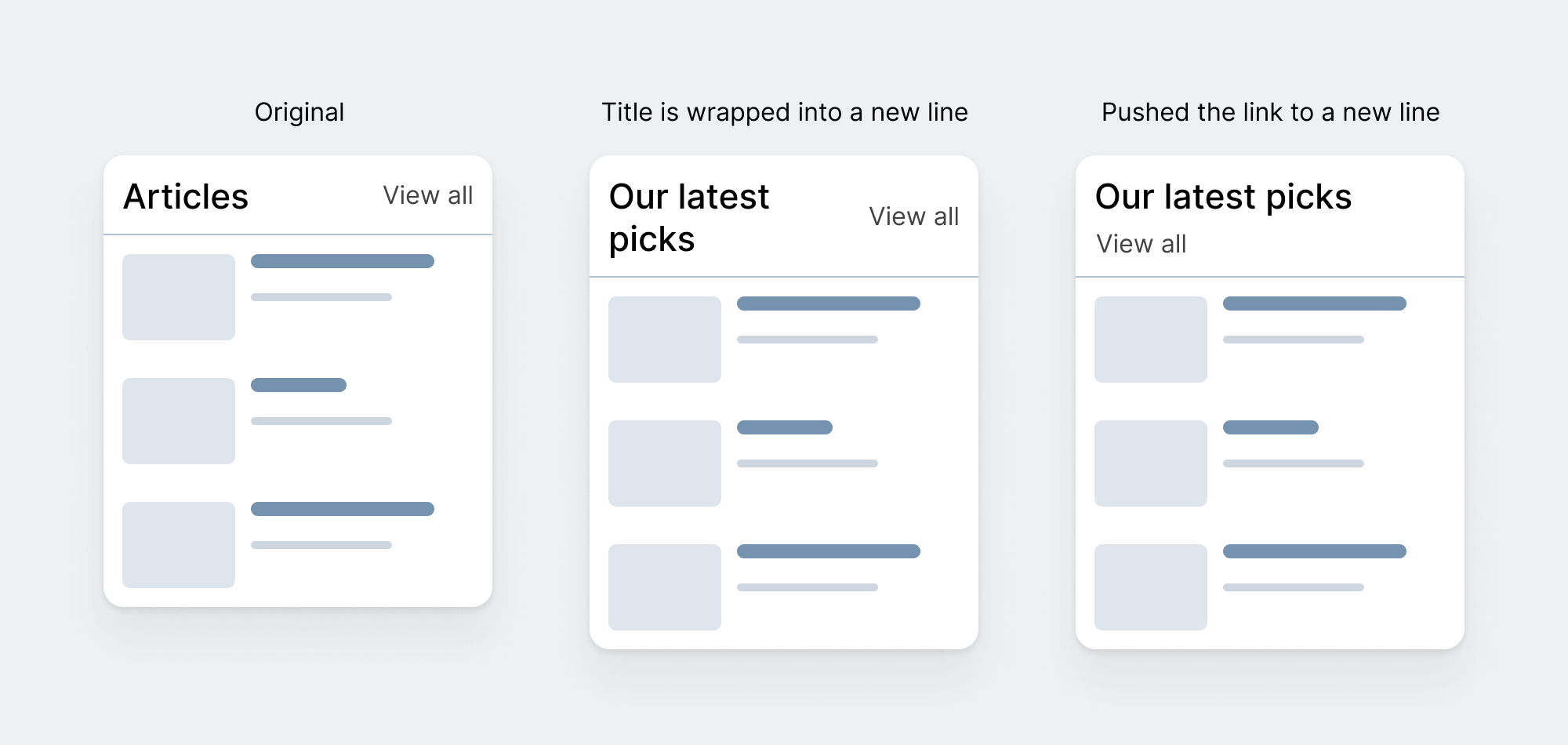
None of the above is a bad result. This is excellent. However, my point is that we must account for that upfront and have control over how the title will wrap.
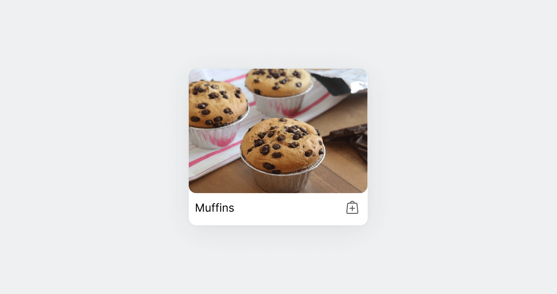
Also, content change is not only about the text. It can happen to images as well. In the following figure, we have a card with an image
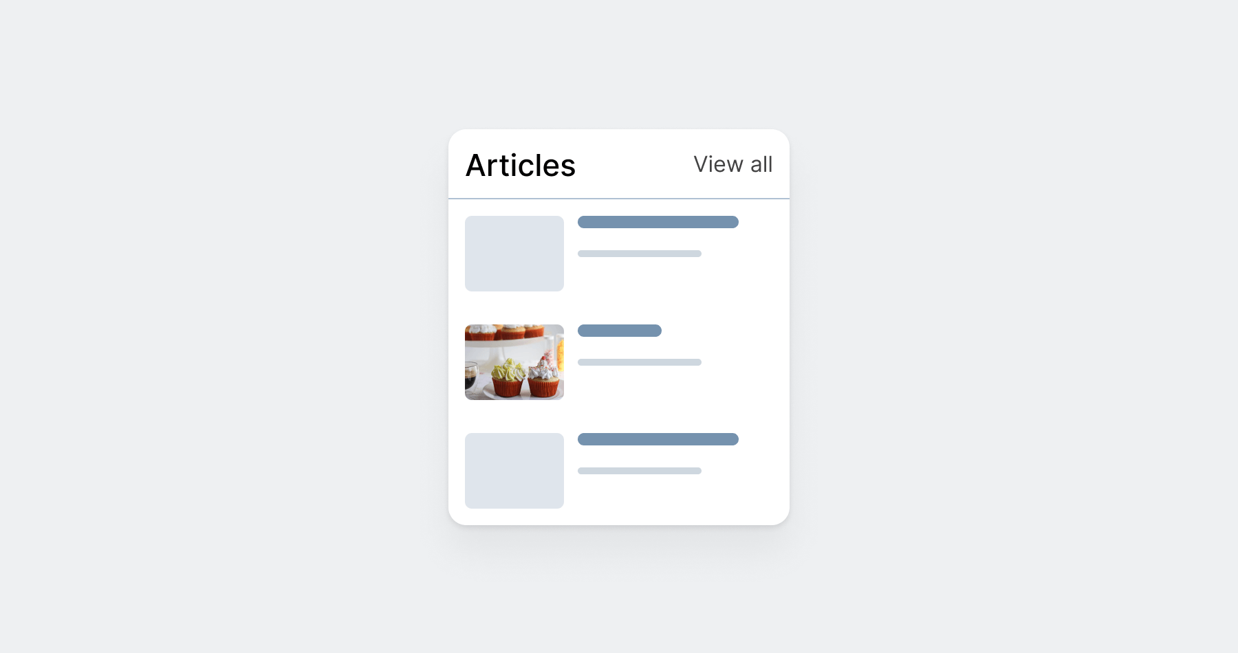
For such a component, we need to ask a few questions:
- Is the image coming from the backend always have a consistent aspect ratio?
- What will happen to the image when the title is too long? You might think that this isn't related but wait and see.
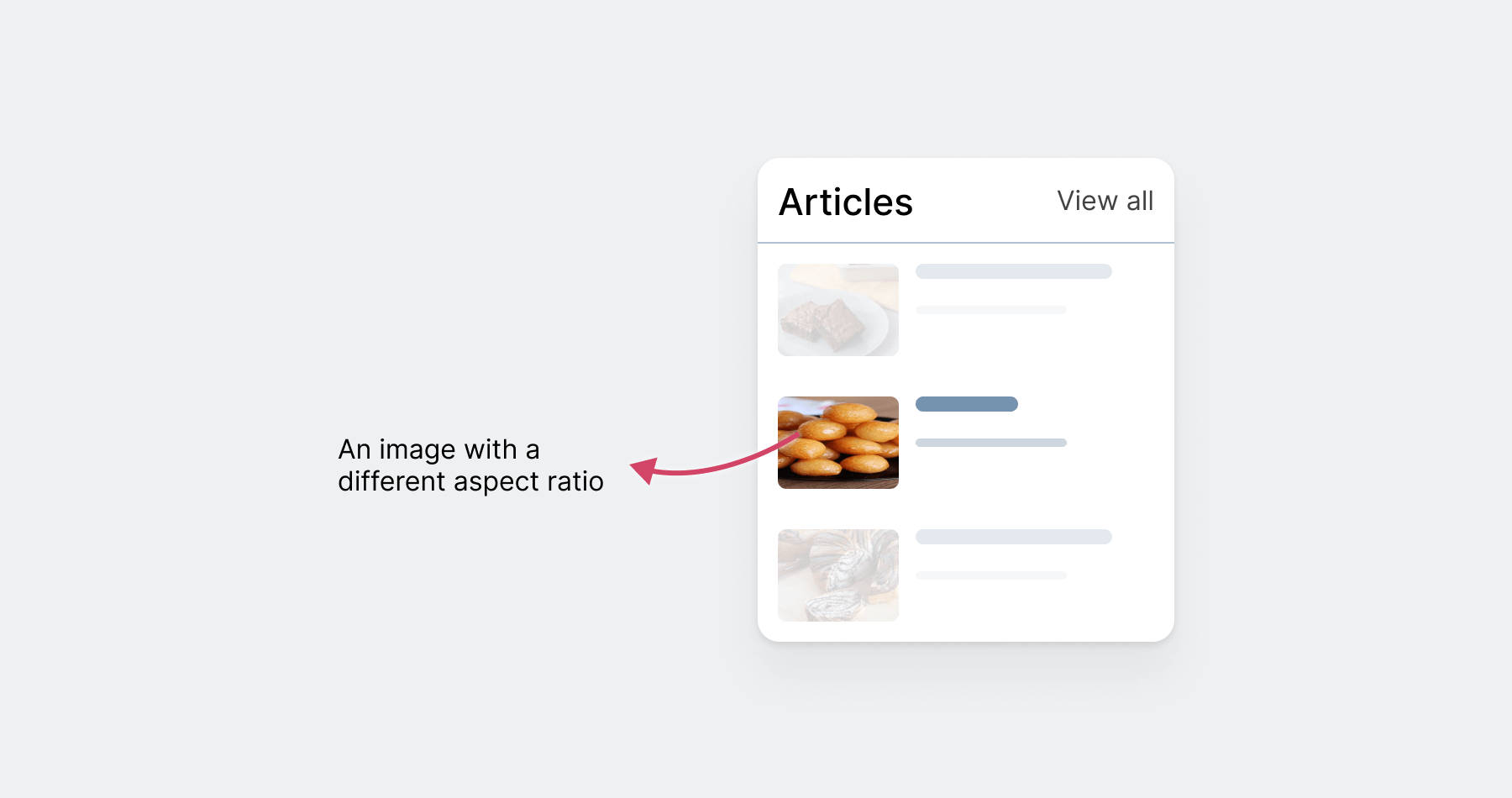
In the above figure, we have an image with a different aspect ratio which is causing the image to stretch horizontally. This isn't good.
Also, if we're using flexbox, we might get a different kind of stretching, which is vertical.
In flexbox, the default behavior is to stretch contents. Given that the card component is built with flexbox, we might get that kind of issue. The fix is explained in this link.
Modern CSS made our life easier
Even though the modern CSS we use today is useful, we need to be careful about how we use it. As you've seen in the previous example, the image stretched vertically to match its sibling's height (the block containing the title and description).
.card {
  display: flex;
}
Adding display: flex and assuming that it will do wonders isn't enough. By default, this will stretch the flex items vertically which means that they will have an equal height.
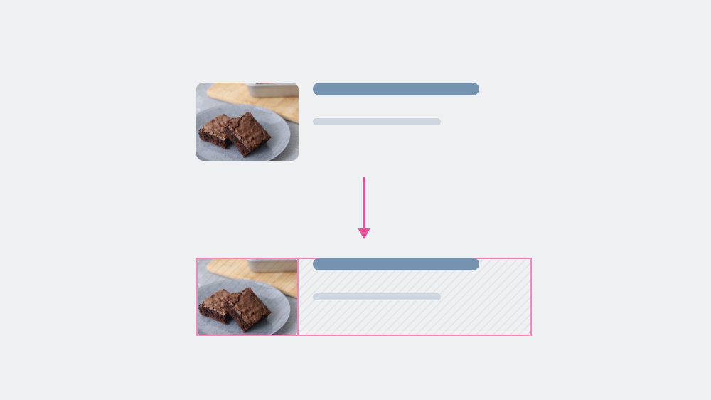
When the card has a longer title or description, the image will be stretched. Consider the following figure:
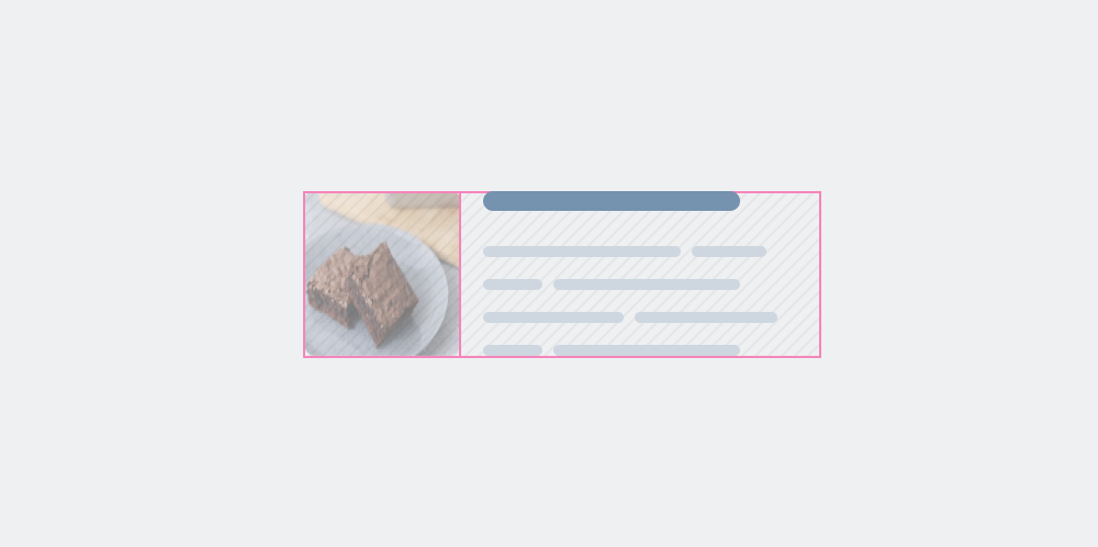
The solution is to override the default stretching behavior. In flexbox, we can use the align-self property to do that.
.card {
  display: flex;
}

.card__thumb {
  align-self: start;
}
Notice how the image is not stretching now, that's due to adding align-self: start to it.
Doing that up front will prevent unexpected issues or behaviors in the future. For some projects, the future is all about adding real content.
Next, we'll explore a perfect UI that looks good with the content that came from the designer.
A UI with a perfect design
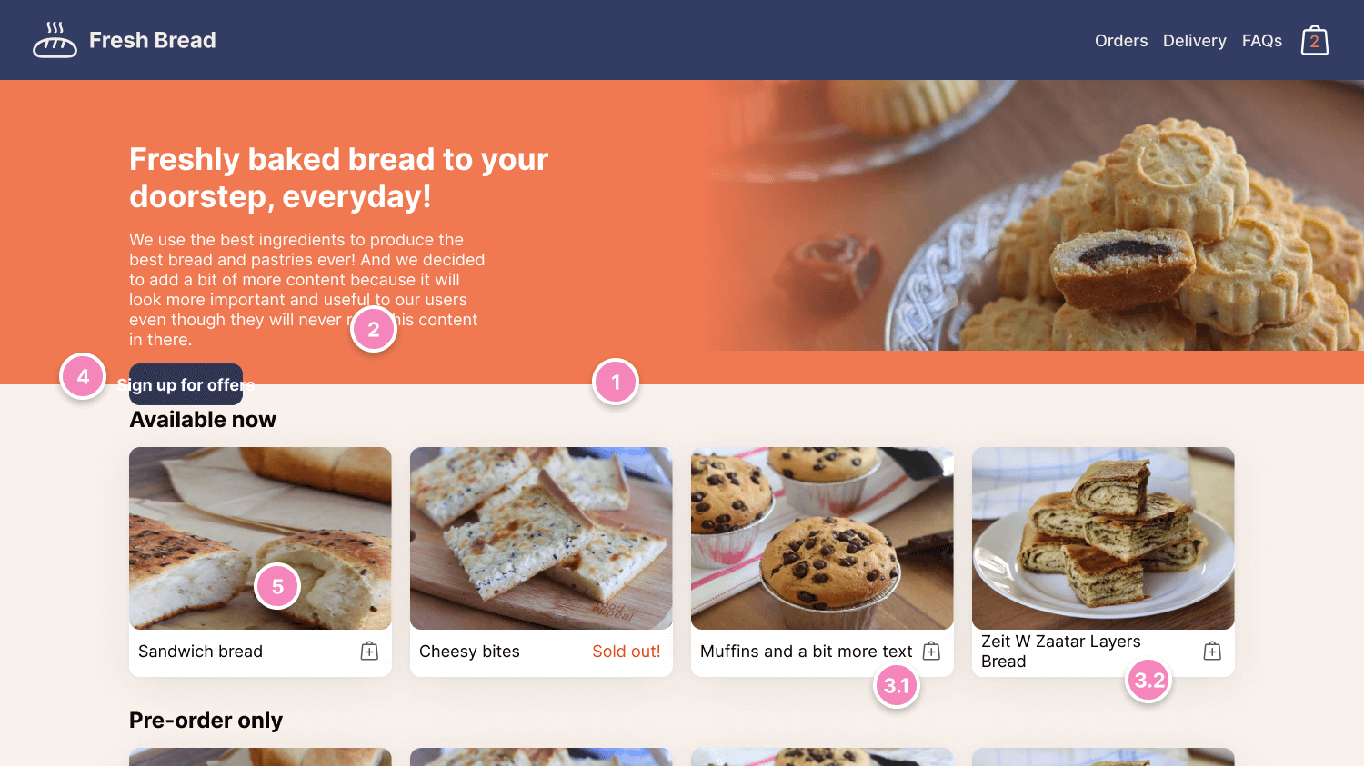
Let's take a look at the following design that looks perfect in terms of imagery and text content.
At the first glance, there are no issues here. But the moment we start to inject different content lengths, we'll start facing UI problems or the design might not look that good.
Consider the following broken design.
Here are a few issues to highlight:
1- The hero section has a fixed height, thus not expanding to fit the larger description text.
2- Hero content is colliding with the section title below it.
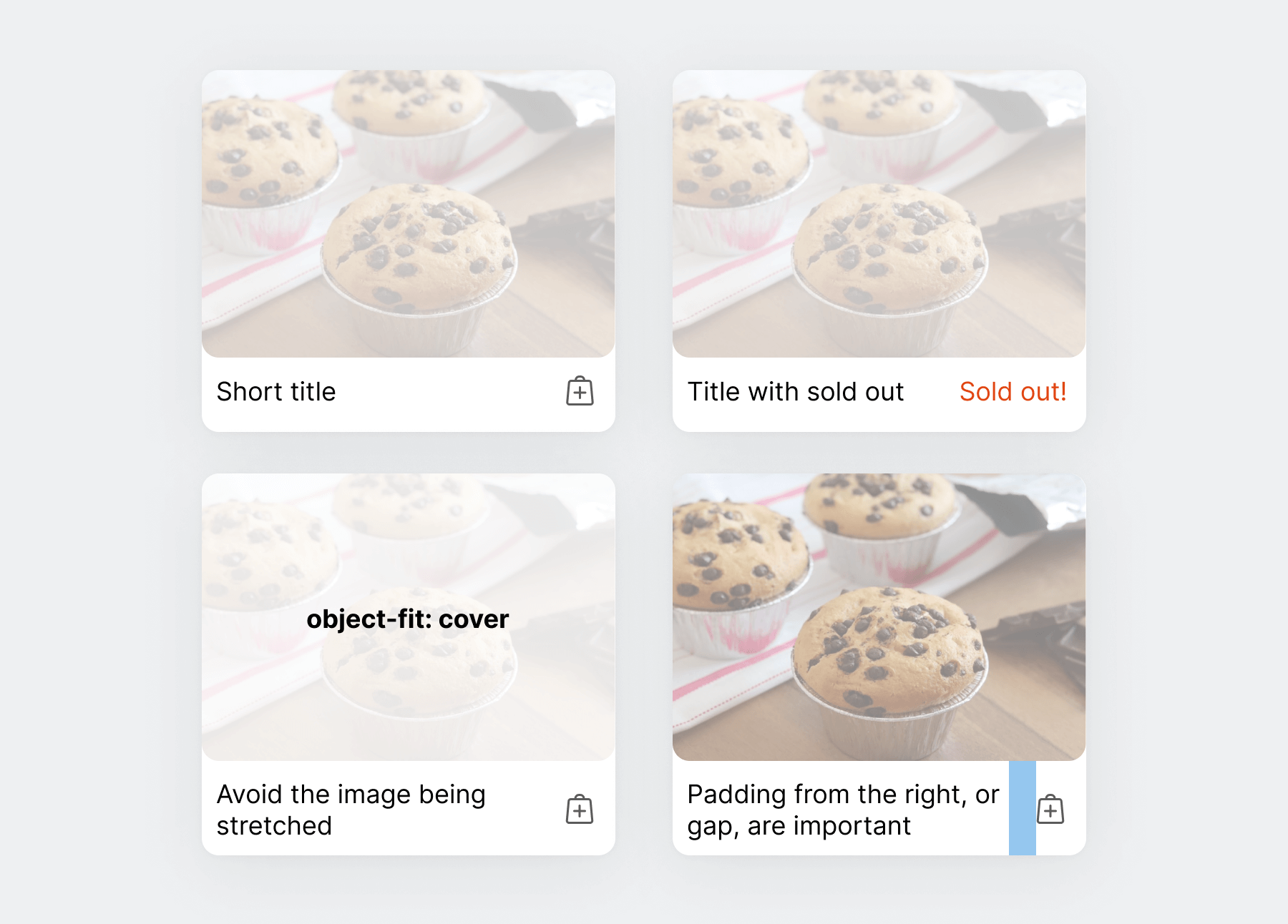
3- Card title text doesn't handle long content well.
1- It's too close to the action (Add to cart). See the muffins card.
2- Text that is wrapped into a new line is too condensed in the white box.
4- Button has a fixed width, thus making it impossible for the user to read the label.
5- The image is stretched due to adding an image with a different aspect ratio than the card.
We can fix that by testing each component and ensuring that we account for the edge cases, but why waste that time after we build the UI? Defensive CSS is about writing CSS that is future-proof and will help prevent, or at least reduce such issues.
A closer look at a component
To explain why designing and coding defensively is useful, I will take the card component as an example.
At the first glance, the card looks easy. However, there are some little things to be taken into consideration.
Here are some of them:
- Make sure the image always has
object-cover, to avoid it being distorted in case of adding an image with a different aspect ratio. - Have space at the end of the title to avoid it being too close to either the "Add to cart" or the "Sold out!" elements.
- Using
aspect-ratioto have a consistent image size.
.card__thumb {
  aspect-ratio: 4/3;
  object-fit: cover;
}

.card__title {
  padding-right: 1.5rem;
}
Thinking ahead leads to adding the above CSS. And that's only on the scale of one component. It's easy to forget that and assume that text won't be long, or images won't change.
What is defensive CSS?
a set of CSS practices that designers and developers can use to write CSS that is future-proof, resulting in fewer bugs in user interfaces.
Defensive CSS as a strategy
When we start thinking of defensive CSS as a strategy, it will help us to reveal hidden secrets that let us design and build layouts with as fewer issues as possible.
I like to think of it as something useful to designers, developers, and QA engineers.
Designers
It's about designing UIs with unknown content in mind.
Developers
Think of it as an advanced CSS reset.
/* [1] Break words when there is enough space */
h1,
h2,
h3,
h4,
h5,
h6,
p,
a {
  overflow-wrap: break-word; /* [1] */
}

/*
[1] Set a maximum width for an image
[2] Let the image cover its bounding box to avoid distortion.
*/
img {
  max-width: 100%; /* [1] */
  object-fit: cover; /* [2] */
}
QA Engineers
As a quality assurance engineer, you can have a list of common CSS issues that are related to content.
Now that you have a good idea about the nature of this little project, I invite you to take a closer look at the defensive tips.
What to expect from Defensive CSS
Currently, this project has over 24 defensive tips. For the future, here is what I'm planning to do:
- Defensive CSS Checklist & Reset.
- Articles that target designers and how we can use modern design tools to help build better defensive user interfaces.
- How to test and break designs. Sometimes it's okay to be a troublemaker.
- Video content.
Thank you very much for reading, until next time.