CSS flexbox is one of the most useful CSS layout features nowadays. It’s tempting to add display: flex to a wrapper and have the child items ordered next to each other.
The thing is when there is not enough space, those child items won’t wrap into a new line by default. We need to change that behavior with flex-wrap: wrap.
Here is a typical example. We have a group of options that should be displayed next to each other.
.options-list {
  display: flex;
}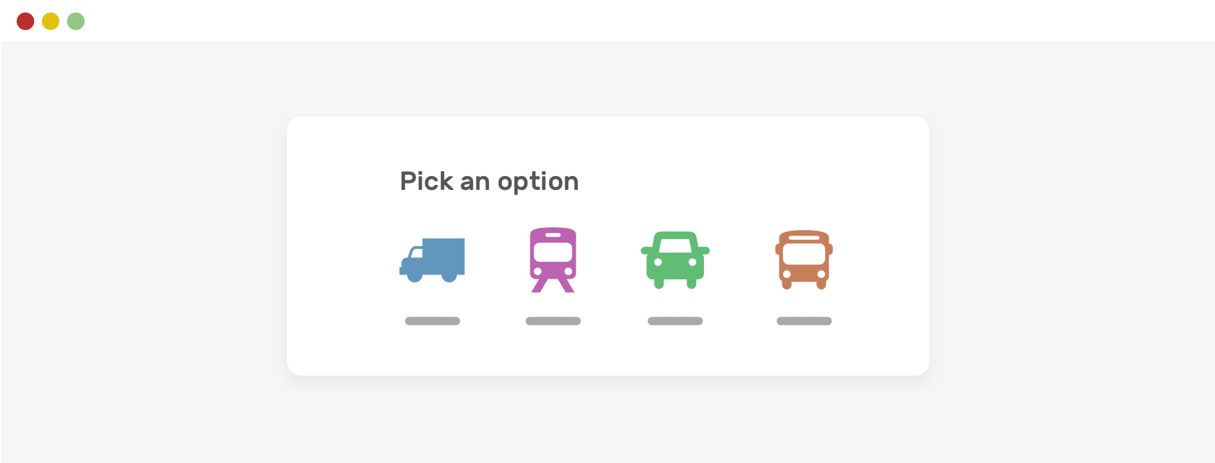
When there is less space, horizontal scrolling will occur. That’s should be expected and isn’t actually a “problem”.
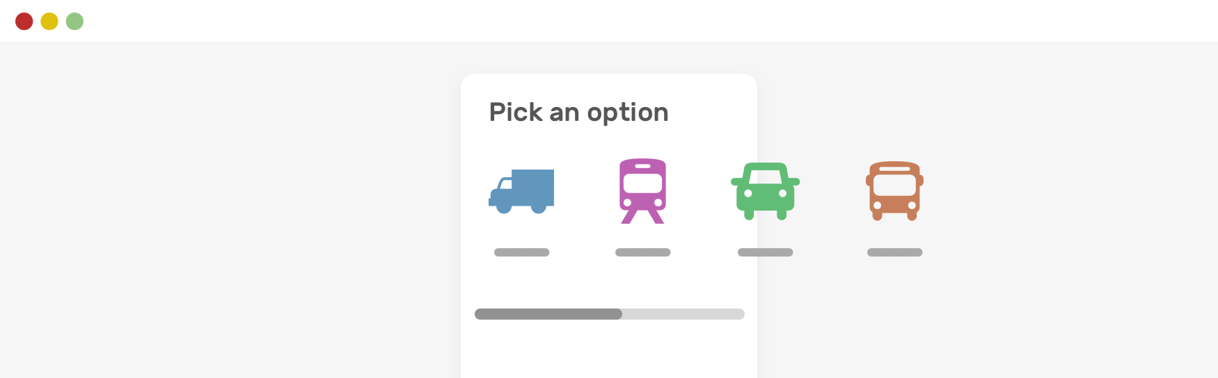
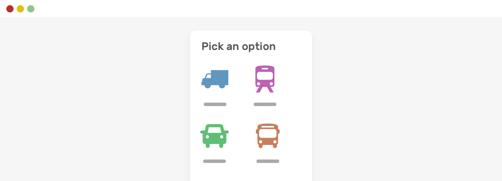
Notice how the items are still next to each other. To fix that, we need to allow flex wrapping.
.options-list {
    display: flex;
    flex-wrap: wrap;
}
Examples and use cases
Breadcrumbs
- Next Image Distortion
Support Defensive CSS
Do you like the content? You can buy me a cup of coffee. Thank you!
About the author

Ahmad Shadeed
Ahmad is a UX designer and front-end developer from Palestine. He enjoys working on challenging design and front-end development projects. He wrote a book on debugging CSS, writes extensively on CSS, Accessibility, and RTL (right to left) text styling.