When using CSS grid minmax() function, it's important to decide between using the auto-fit or auto-fill keywords. When used incorrectly, it can lead to unexpected results.
When using minmax() function, the auto-fit keyword will expand the grid items to fill the available space. While auto-fill will keep the available space reserved without altering the grid items width.
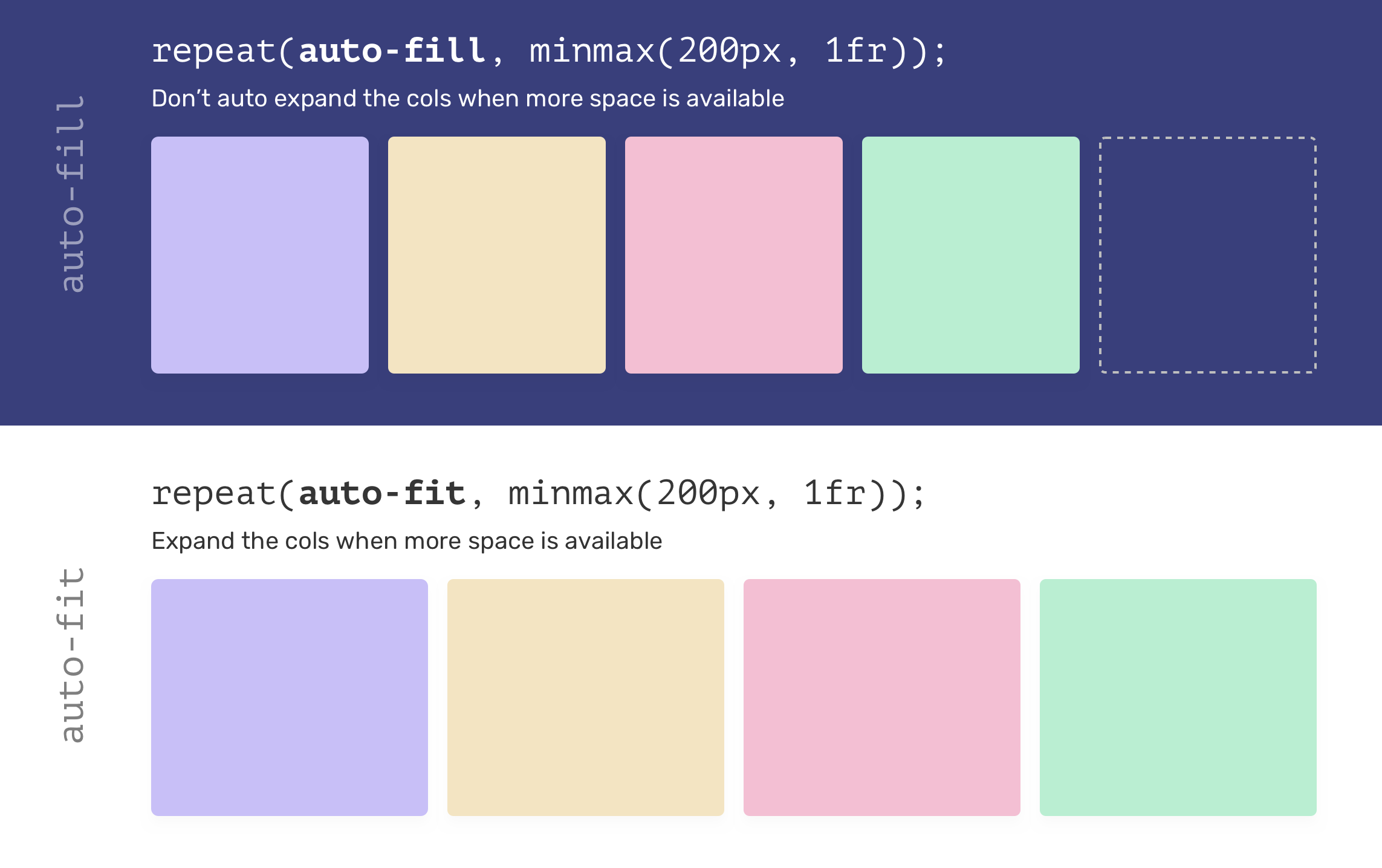
That being said, using auto-fit might lead to grid items being too wide, especially when they are less than expected. Consider the following example.
.wrapper {
    display: grid;
    grid-template-columns: repeat(auto-fit, minmax(250px, 1fr));
    grid-gap: 1rem;
}
If there is only one grid item and auto-fit is used, the item will expand to fill the container width.

Most of the time, such behavior isn't needed, so using auto-fill is better in my opinion.
.wrapper {
    display: grid;
    grid-template-columns: repeat(auto-fill, minmax(250px, 1fr));
    grid-gap: 1rem;
}
Examples and use cases
Spacing
.wrapper {
  --sizing: auto-fit;
  display: grid;
  grid-template-columns:
  repeat(var(--sizing), minmax(100px, 1fr));
  grid-gap: 1rem;
}
CSS is awesome
CSS is awesome
If you want to learn more about the minmax() function, I recommend you to read this article about it on my blog.
- Previous Component Spacing
- Next Background repeat
Support Defensive CSS
Do you like the content? You can buy me a cup of coffee. Thank you!
About the author

Ahmad Shadeed
Ahmad is a UX designer and front-end developer from Palestine. He enjoys working on challenging design and front-end development projects. He wrote a book on debugging CSS, writes extensively on CSS, Accessibility, and RTL (right to left) text styling.