If a flex item has a text element or an image that is bigger than the item itself, the browser won’t shrink them. That is the default behavior for flexbox.
Consider the following example.
.card {
    display: flex;
}
Even if we use overflow-wrap: break-word, it won’t work.
.card__title {
    overflow-wrap: break-word;
}
To change that default behavior, we need to set the min-width of the flex item to 0. That’s because the min-width default value is auto, the overflow happens.
.card__title {
    overflow-wrap: break-word;
    min-width: 0;
}
The same thing applies to a column flex wrapper, but we will use min-height: 0 instead.
Examples and use cases
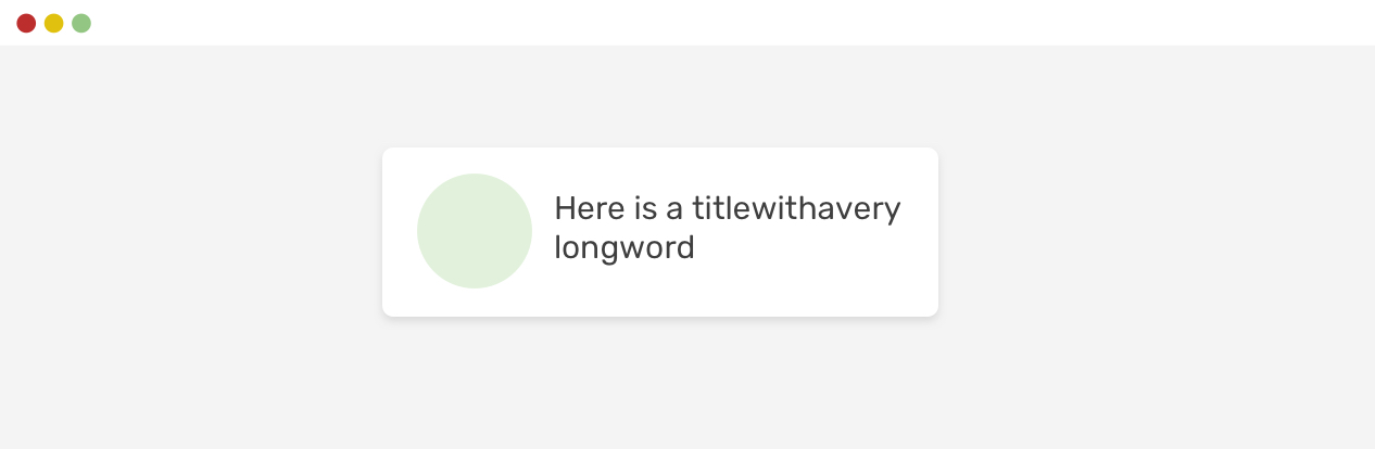
Long card title
In this example, the card title is too long. As a result, flexbox will apply the default behaviour which is to make the element size as equal to its content length.
That's because the default min-width value is auto.
This is a sampletitlethatisabiglong
To fix that, we need to apply min-width: 0 on the flex item. Try to check the "Toggle defensive" checkbox to see it yourself.
- Previous Fixed sizes
- Next Minimum Content Size In CSS grid
Support Defensive CSS
Do you like the content? You can buy me a cup of coffee. Thank you!
About the author

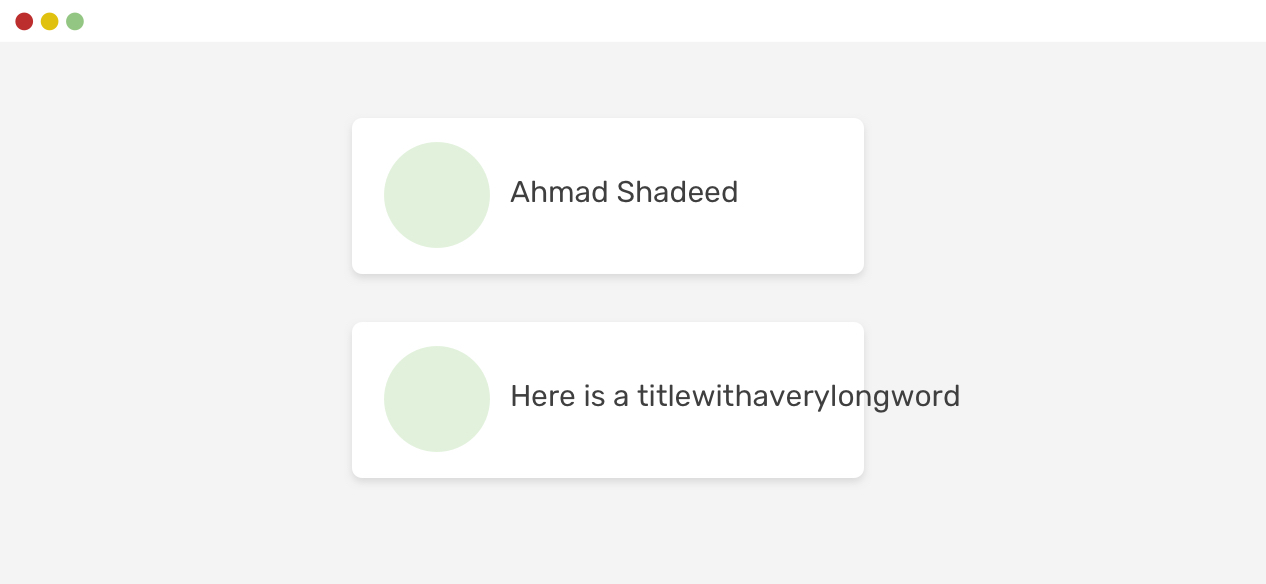
Ahmad Shadeed
Ahmad is a UX designer and front-end developer from Palestine. He enjoys working on challenging design and front-end development projects. He wrote a book on debugging CSS, writes extensively on CSS, Accessibility, and RTL (right to left) text styling.