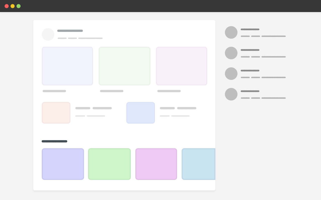
Similar to flexbox, CSS grid has a default minimum content size for its child items which is auto. That means, if there is an element that is larger than the grid item, it will overflow.

In the example above, we have a carousel within the main section. For context, here is the HTML and CSS.
<div class="wrapper">
    <main>
        <section class="carousel"></section>
    </main>
    <aside></aside>
</div>
@media (min-width: 1020px) {
.wrapper {
display: grid;
grid-template-columns: 1fr 248px;
grid-gap: 40px;
}
}
.carousel {
display: flex;
overflow-x: auto;
}Since the carousel is a flex container that doesn’t wrap, its width is larger than the main section, and thus the grid item respected that. As a result, there is horizontal scrolling.
To fix that, we have three different solutions:
- Using
minmax() - Applying
min-widthto the grid item - Adding
overflow: hiddento the grid item
As a defensive CSS mechanism, it doesn't matter which solution to pick, but for this example I will go with the min-width one.

I wrote about that in more detail. I also highly recommend checking "Preventing a Grid Blowout" and "You want minmax(10px, 1fr) not 1fr" by Chris Coyier.
Examples and use cases
Main and aside
Based on the previous illustrated demo, we have a page that contains a main and an aside sections. The main section has a scrollable element (a carousel).
<div class="page">
    <div class="page__item page__item--main">
        <div class="slider">
            <div class="slider__item"></div>
            <!-- more items -->
        </div>
    </div>
    <div class="page__item page__item--aside"></div>
</div>
.slider {
display: flex;
}
.page {
display: grid;
grid-template-columns: 1fr 100px;
grid-gap: 1rem;
}The element .page__item--main is a grid item, and when the .slider doesn't wrap its child items, the main grid item will expand to fit all the slider items.
To overcome that, we can pick one of the solutions mentioned above. For this example, I will pick min-width: 0.
Aside
Try to click the "Toggle Defensive" option to see the solution in action.
.page__item--main {
    /* prevent the grid item from respecting the
    * minimum content size
    */
    min-width: 0;
}- Previous Minimum Content Size In CSS Flexbox
- Next Grouping vendor selectors
Support Defensive CSS
Do you like the content? You can buy me a cup of coffee. Thank you!
About the author

Ahmad Shadeed
Ahmad is a UX designer and front-end developer from Palestine. He enjoys working on challenging design and front-end development projects. He wrote a book on debugging CSS, writes extensively on CSS, Accessibility, and RTL (right to left) text styling.