Sometimes, it’s so tempting to build a component and only test by resizing the browser’s width. Testing against the browser’s height can reveal some interesting problems.
Here is one that I’ve seen multiple times. We have an aside component with main and secondary links. The secondary links should be positioned at the very bottom of the aside section.
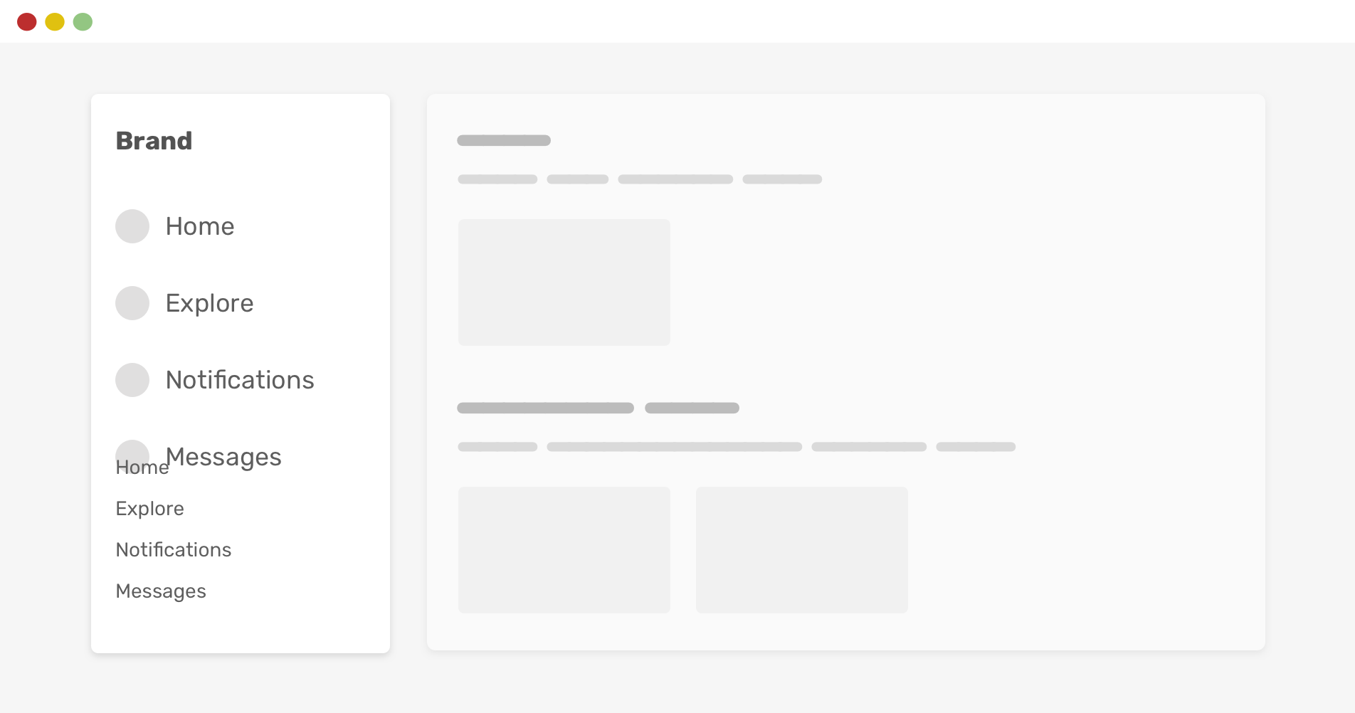
Consider the following example. The main and secondary navigation looks okay. In the example that I saw, the developer added position: sticky to the secondary navigation so that it can stick to the bottom.
However, if the browser height is smaller, things will break. Notice how the two navigations are overlapped.
By using CSS vertical media queries, we can avoid that issue.
That way, the secondary navigation will only be sticked to the bottom if the viewport height is larger than or equals 600px. Much better, right?
There are probably better ways to implement that behavior (like using margin-auto) but I’m focusing on the vertical query for this example.
If I want to explain using CSS vertical media query, I need to write a full article about it. The good news is that I already wrote one, in case you’re interested.
- Previous Text over image
- Next Accidental hover on mobile
Support Defensive CSS
Do you like the content? You can buy me a cup of coffee. Thank you!
About the author
Ahmad Shadeed
Ahmad is a UX designer and front-end developer from Palestine. He enjoys working on challenging design and front-end development projects. He wrote a book on debugging CSS, writes extensively on CSS, Accessibility, and RTL (right to left) text styling.