When dealing with user avatars, it can be challenging to display them all in a clear way. That's because some images are too light, thus it might blend with the background underneath it, specially if it's a white one.
Consider the following figure.
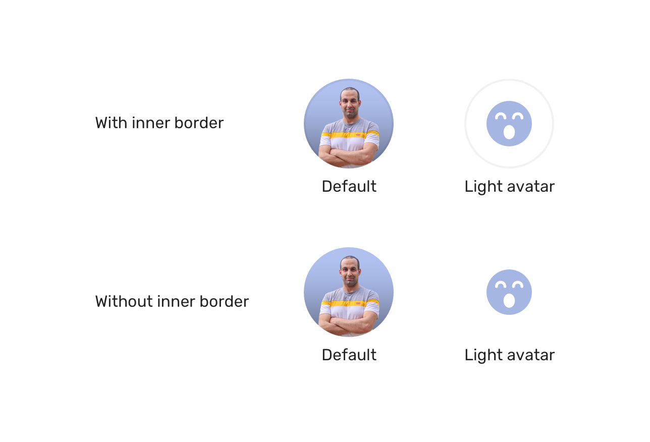
Notice how in the first row, the second avatar is blended with the white background. However, when we have a border, it's much better.
We can prevent that in advance and add an inner border to the image. Not only that, but we cal also think about dark mode too!
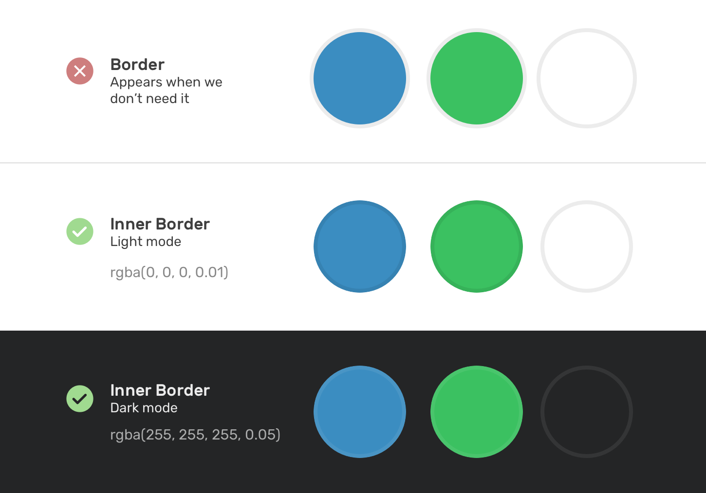
In CSS, we can mimic the inner border by using an inset box-shadow. The challenge though is that it's not possible to add an inset shadow to an <img> element. As a result, we need to wrap the image in another element and apply the inner shadow to it.
<div class="card__avatar">
  <img src="assets/shadeed.jpg" alt="" />
  <div class="border"></div>
</div>
.card__avatar {
position: relative;
}
.card__avatar img {
width: 56px;
height: 56px;
border-radius: 50%;
}
.border {
position: absolute;
width: 56px;
height: 56px;
border: 2px solid #000;
border-radius: 50%;
opacity: 0.1;
}- Previous Accidental hover on mobile
- Next Default flexbox stretching
Support Defensive CSS
Do you like the content? You can buy me a cup of coffee. Thank you!
About the author

Ahmad Shadeed
Ahmad is a UX designer and front-end developer from Palestine. He enjoys working on challenging design and front-end development projects. He wrote a book on debugging CSS, writes extensively on CSS, Accessibility, and RTL (right to left) text styling.