In a flex container, you might use justify-content to space the child items from each other. With a certain number of child items, the layout will look okay. However, when they increase or decrease, the layout will look odd.
Consider the following example.
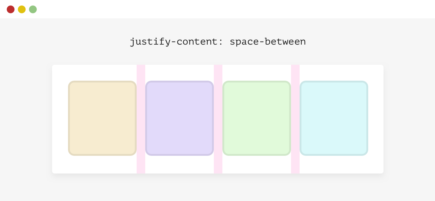
We have a flex container with four items. The spacing between each item isn’t a gap or margin, it’s there because the container has justify-content: space-between.
.wrapper {
    display: flex;
    flex-wrap: wrap;
    justify-content: space-between;
}
When the number of items is less than four, here is what will happen.
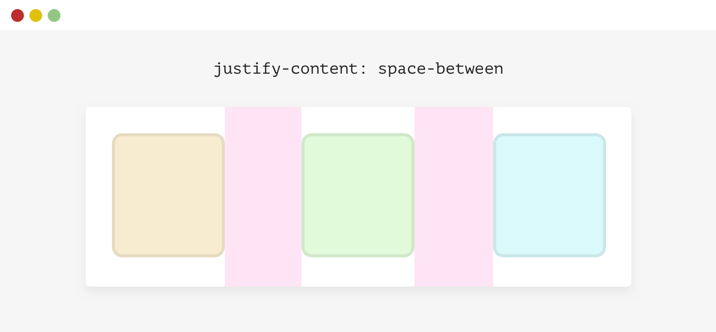
This isn’t good. There are different solutions to this:
- Margin
- Flexbox gap (Use with caution)
- Padding (Can be applied to the parent of each child element)
- Adding empty elements to act as a spacer.
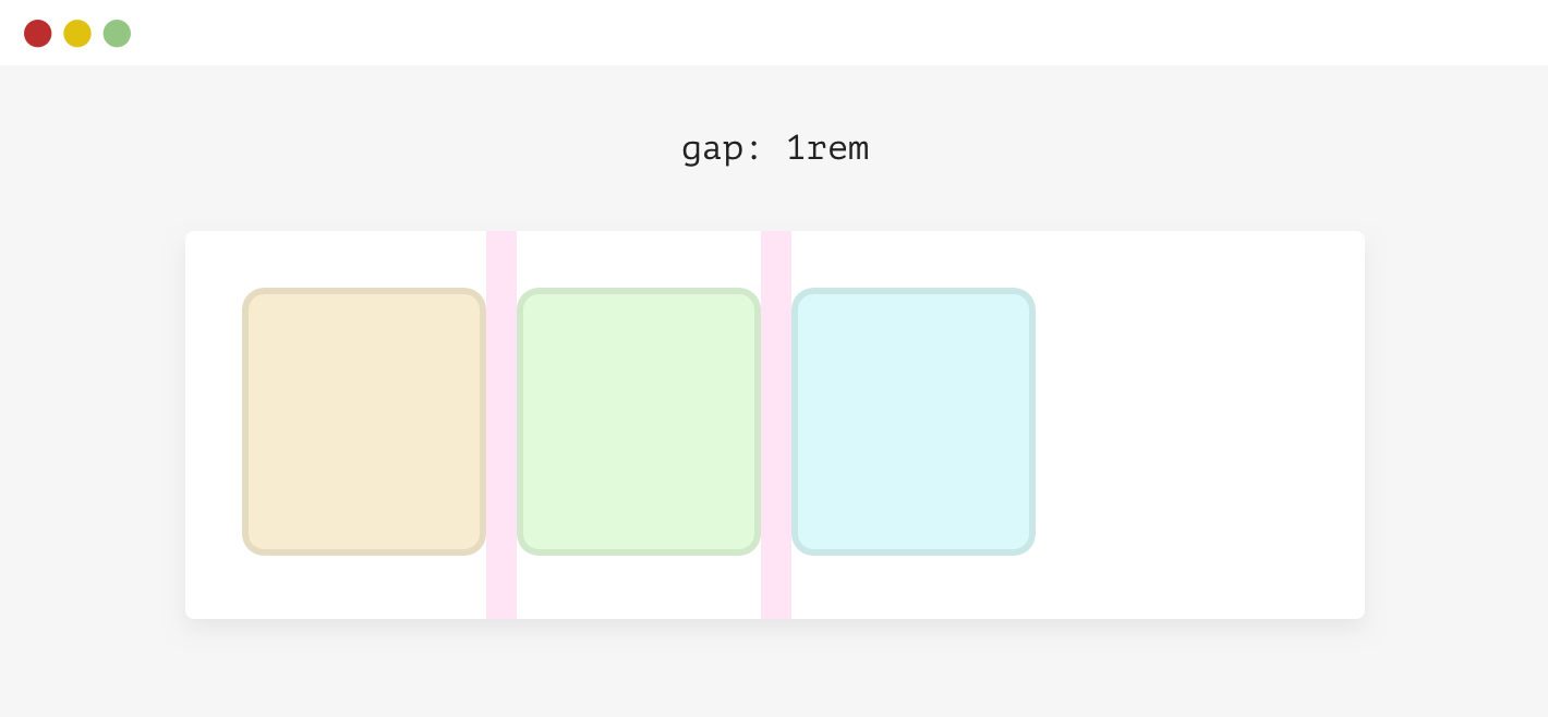
For simplicity, I will use gap.
.wrapper {
    display: flex;
    flex-wrap: wrap;
    gap: 1rem;
}
Examples and use cases
- Previous Scrollbars on demand
- Next Text over image
Support Defensive CSS
Do you like the content? You can buy me a cup of coffee. Thank you!
About the author

Ahmad Shadeed
Ahmad is a UX designer and front-end developer from Palestine. He enjoys working on challenging design and front-end development projects. He wrote a book on debugging CSS, writes extensively on CSS, Accessibility, and RTL (right to left) text styling.