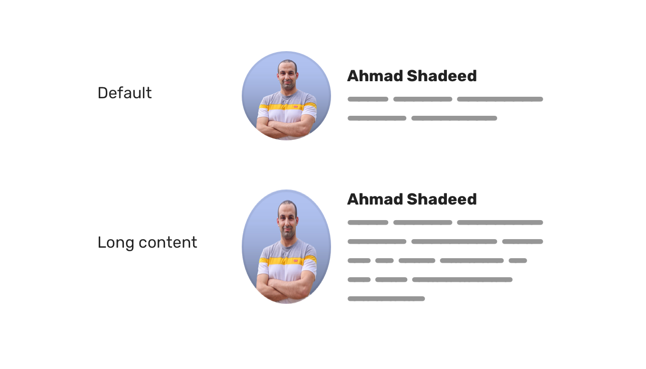
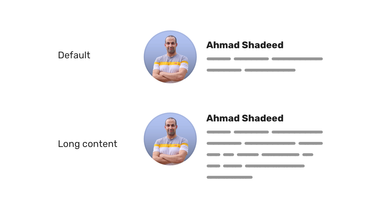
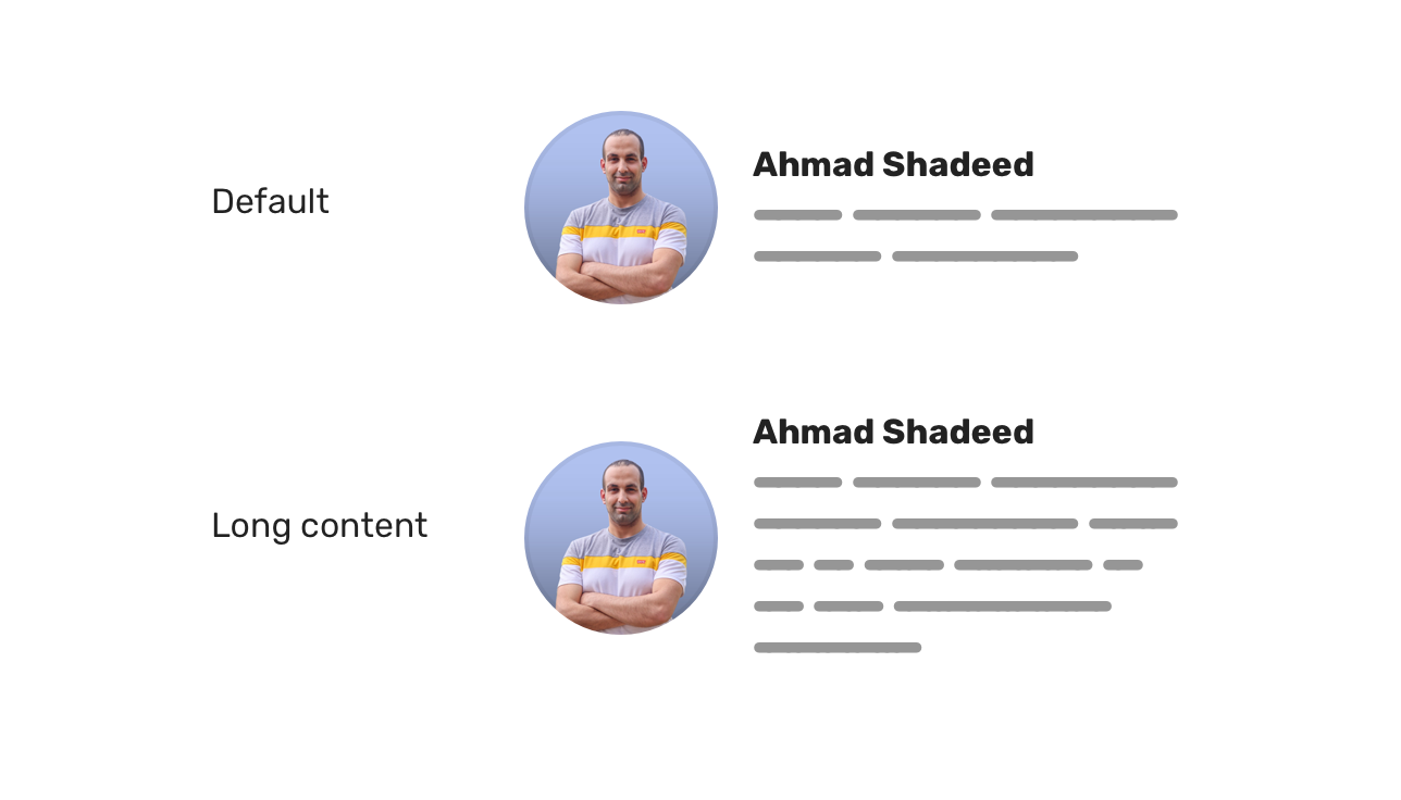
In flexbox, the default behaviour for flex items is to stretch. If a child item has content longer than its sibling, this will cause the other item to stretch.
This can't be spotted easily unless we add longer content than expected to a flex item.
Consider the following HTML and figure. We have a component that contains an avatar, name, and a biography.
<div class="person">
<img class="person__avatar" src="img/avatar.jpg" alt="">
<div class="person__content">
<h3>Ahmad Shadeed</h3>
<p></p>
</div>
</div>
.person {
    display: flex;
}

When the bio content (the .person__content element) exceeds the height of the avatar, this will result in the stretching of the avatar.
To fix that, we need to override the default stretching behavior and keep the avatar aligned to the start (or the center) of its parent.
.person__avatar {
align-self: start;
}

Or you can use align-items: center on the parent element. Whatever works best for your case!
.person {
    display: flex;
    align-items: center;
}

Examples and use cases #

